Five Color Combinations You Need to Try This Fall

April 26, 2024
By: Christopher Godfrey
Just like your wardrobe transitions with the seasons, so you can your living space! You’ve already retired your sandals for the year and replaced them with more seasonally appropriate boots. Why not give your home décor the same update?
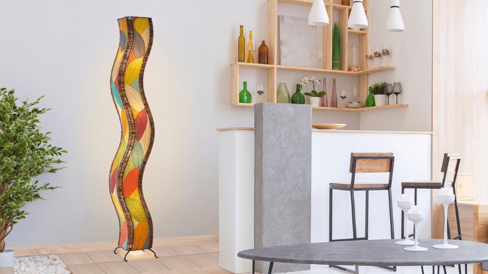
A few weeks ago, we talked about how color sets the tone of a room. Even small pops of color can completely change the look and feel of your space. By switching up a few accent colors, your room can transform from beach vibes to fall cozy.
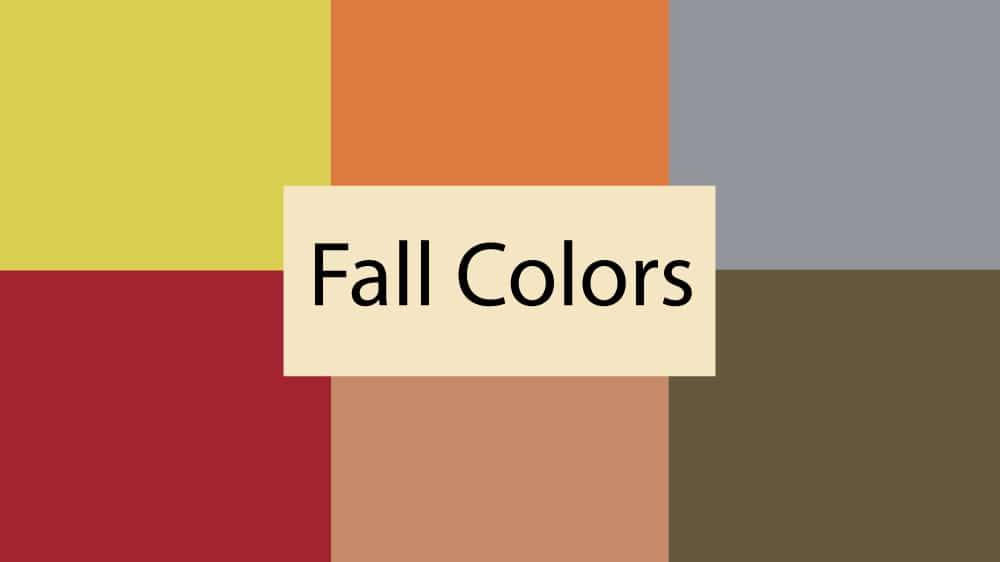
When choosing fall accent colors, break away from the traditional hues. The Pantone autumn 2020 trend report shows us that there’s more to the season than mustard yellow. With a blend of classic tones and bold color statements, fall 2020 has something for everyone. Read on to see which five color combinations you need to try.
# 1 – Blue Depths + Sleet
Earlier this year, Pantone declared 2020 to be the year of blue (Classic Blue, that is). Blue Depths is a deeper tone that feels more like classic autumn. When paired with another timeless shade, Sleet, you have a time-honored fall color combination. If bold hues like reds and oranges are a bit much for you, this conservative pairing may be your perfect fall look.
Our picks: Try the 60“ Blue Oar with Arrow with the Wire Sailboat Gray Sculpture. Is this giving anyone else fall in New England vibes?
# 2 – Green Sheen + Military Olive
Even though blue is the color of the year, green will never go out of style. Olive has been quite popular the last few years and the shade Military Olive is no exception. It’s a great foundation color and can even work as a neutral. Pair with Green Sheen for an unexpected blend. Green Sheen is a vibrant, yellow-green color and not your typical autumn shade. This combo is the perfect choice if you want to mix a classic hue with a bold color statement.
Our picks: Flower Wall Décor Green + Metal Tripod Drum Table Green. Mix and match green accent pieces to contrast your neutral walls.
# 3 – Almond Oil + Military Olive
If neutrals are more your speed, consider Almond Oil—an off-white shade reminiscent of the almond milk in your latte. Pair this neutral with a classic green like Military Olive and you’ve got an understated, fall combination.
Our picks: Drum Hanging Large Natural + Polearm Table Lamp Green. Make a statement from floor to ceiling with lighting and other pops of color like a rug or curtains.
# 4 – Amberglow + Samba
You can never go wrong with orange in the fall. This year, Amberglow, is a brighter, more in-your-face shade of orange. When paired with Samba, a fiery orange-red, you’re sure to add a ton of energy to a room.
Our picks: Cylinder Pendant Red + Pendulum Orb Table Lamp Orange. These bright pieces are great accents and will pick up the orange/red hues from your existing fall décor.
# 5 – Classic Blue + Samba + Sandstone
Classic Blue is the Pantone Color of the Year and for good reason. It’s a flattering color that pairs well with neutrals or more punchy shades. If you’re loving Samba, but the above red-orange combination feels too intimidating, try Classic Blue and Samba. Then throw in a shade like Sandstone—the perfect rustic, outdoorsy neutral—for a well-rounded feel.
Our picks: Elephant Wall Décor Blue + Faraday Large Floor Lamp Red + Mini Paper Cylinder Glacier. When decorating your home for the seasons, don’t stop at your living room! Pair these lamps and accent pieces with a new duvet and give your bedroom a fall makeover. The change in seasons is a great opportunity to refresh your space. Whether you’re sticking with traditional hues, trying one of the color combinations above, or making your own rules, you can’t go wrong.
Related posts
Published On: March 6, 2024
By: Shay Elder
Discover the beauty of mixing different design genres to get the look that is truly yours. Create a personalized ambiance that reflects you.
Published On: June 8, 2023
By: Shay Elder
Elevate your home decor with the addition of floor lamps! Discover the benefits and how to incorporate them with practical tips in this blog.
Published On: April 24, 2023
By: Shay Elder
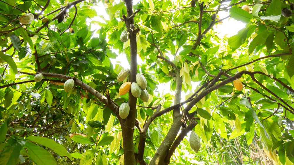
Chocolate is a beloved treat enjoyed by millions of people around the world and it has a special place in our hearts and the leaves of that plant are incorporated into many of our lighting designs. As a food it's hard to resist the smooth, rich, and creamy taste of chocolate, whether it's in a bar, a truffle, or a cake. But have you ever wondered where chocolate comes from and how it's grown? In the Philippines, chocolate is grown in a unique and fascinating way that makes it a truly awe-inspiring crop.


